One of our personal pet peeves in looking at historical economic data is that often, information that could easily be presented on a graph to provide greater insight, isn't. Here's an example of what I mean, using a chart that recently appeared at Barry Ritholtz's The Big Picture:

Now, the chart itself is the product of the folks at EPI who, aside from their left-wing partisan bias, also have a history of excessive myopia when it comes to presenting economic data (most likely because correcting their "myopia" would tend to significantly weaken their arguments.)
So, what useful information could have been presented with this particular chart to provide greater context to EPI's arguments, or potential lack thereof? Well, since the chart is comparing the current performance of the most recent economic recovery to the averages of dozens of others, it would be really, really useful if we could get a sense of the range for each of the various statistics for the previous recoveries. To provide proper context, we should, at the very least, be able to see what the previous best performance and worst performance were for each statistic on the chart.
In other words, we want to see something like a box and whiskers bar chart, the following example of which provides substantially more information in context than the previous example produced by EPI. In the chart below, we're looking at the number of days that the temperature in the indicated cities exceeds 100 degrees Fahrenheit:
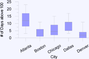
In this example, we can see at a glance the maximum for each range, the minimum, the average and even the upper and lower quartiles that show us where at least 50% of the data occurs for each of the cities listed. Is the relevant data available to EPI to produce a chart showing the full spectrum of economic recovery performance? You bet! They couldn't calculate the averages they show otherwise! Are they going to improve their presentation of information anytime soon? We'll see. I suppose it's always possible that someone will send them a copy of Edward Tufte's new book (HT: The New Economist), although whether they would read and use it is another open question....
Welcome to the blogosphere's toolchest! Here, unlike other blogs dedicated to analyzing current events, we create easy-to-use, simple tools to do the math related to them so you can get in on the action too! If you would like to learn more about these tools, or if you would like to contribute ideas to develop for this blog, please e-mail us at:
ironman at politicalcalculations
Thanks in advance!
Closing values for previous trading day.
This site is primarily powered by:
CSS Validation

RSS Site Feed
JavaScript
The tools on this site are built using JavaScript. If you would like to learn more, one of the best free resources on the web is available at W3Schools.com.
Other Cool Resources
Blog Roll


